Three New Languages, Fine-Tuned Store Creation, Simplified Backoffice Menu
Your Store in Your Language
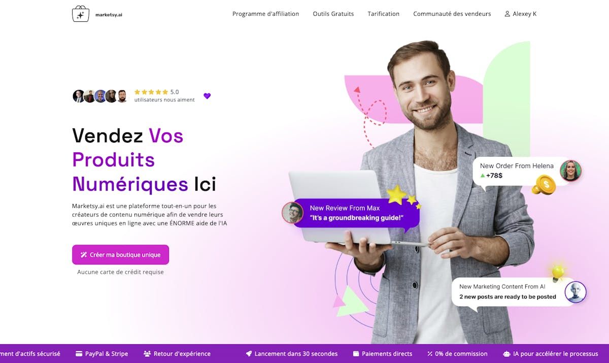
English is definitely a universal language today, but we are facing growing demand from European creators who want to promote their products in their native languages. As a result, we’ve translated Marketsy.ai into three new languages: French, German, and Polish.
Why is it important to provide service in the local language?
The mother tongue is closer to your audience's hearts. No speech can reach your fans and customers better than one in the language they speak. Language is emotive, and the most powerful emotions only come through in our mother tongue. Additionally, language expresses belonging to a culture and, at the end of the day, makes you one with your audience.
Thanks to cutting-edge technology and AI, we managed to localize everything in one day. However, as we are not native speakers of the listed languages, we would be more than happy if you share your feedback about any inaccuracies you find. As a token of gratitude, we will provide you with discounts and free services.
Try the new language experience.
 Marketsy.ai landing page in French
Apply Your Unique Store’s Style from the Very Beginning
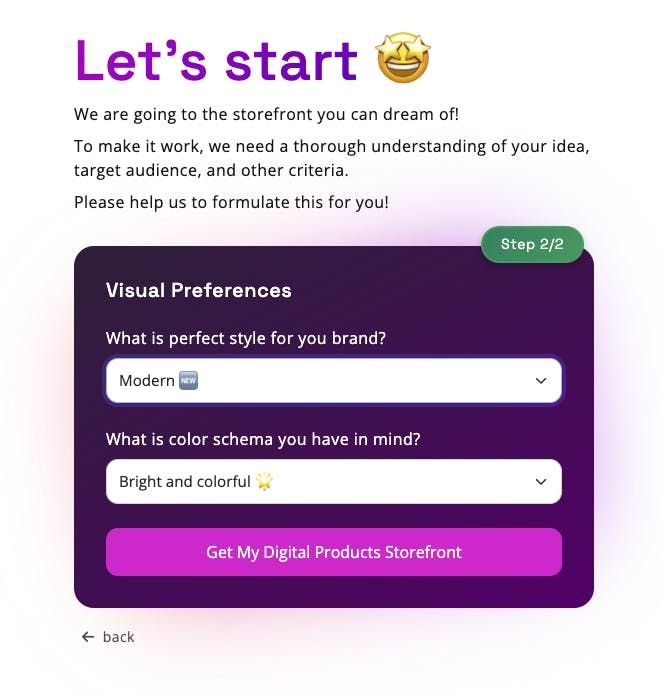
An updated store creation flow has been released. We got rid of redundant steps and added ones that you might really care about. Now, you can select your brand style from:
- Minimalistic ✨
- Modern 🆕
- Classical 🎩
- Neutral ⚖️
And the color scheme can be chosen from:
- Bright and colorful 🌟
- Calm and peaceful 🌿
- Neutral ⚖️
Just provide your answers and let the machine do the rest. This information is provided to our AI to give your new store a more appealing look. You can play around with the combinations of your ideas and visuals to find the perfect match.
Create a store for your digital products with the new visual settings.
 Updated store creation flow on Marketsy.ai
Fewer Buttons to Avoid Overwhelming You
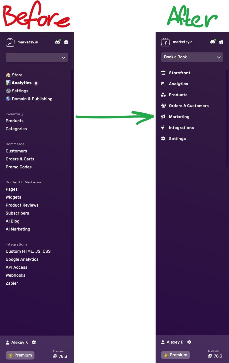
As I’ve already mentioned, the navigation in the admin portal of the store had become monstrous. If you had to use it on your mobile phone, we’re really sorry. But finally, we refined the menu, and it shouldn’t be as scary as it used to be.
Don’t worry about the functions you like. Everything remains as it was, but now it belongs to proper categories.
Try the new backoffice navigation and let us know if it has improved.
P.S. Did you notice that I mixed up these menu screenshots in last week’s illustration? I hope you did, otherwise, why do I write this weekly? 😅
 New navbar in Marketsy.ai backoffice
Add a New Sales Channel
- • Digital downloads
- • Courses & tutorials
- • Visual & audio assets
- • Game credits or licenses
- • Private memberships

